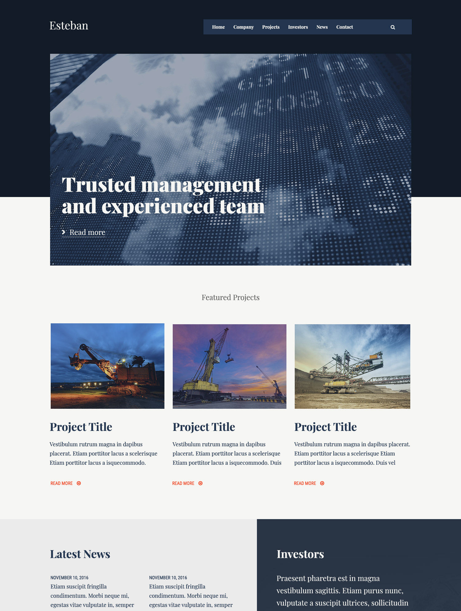
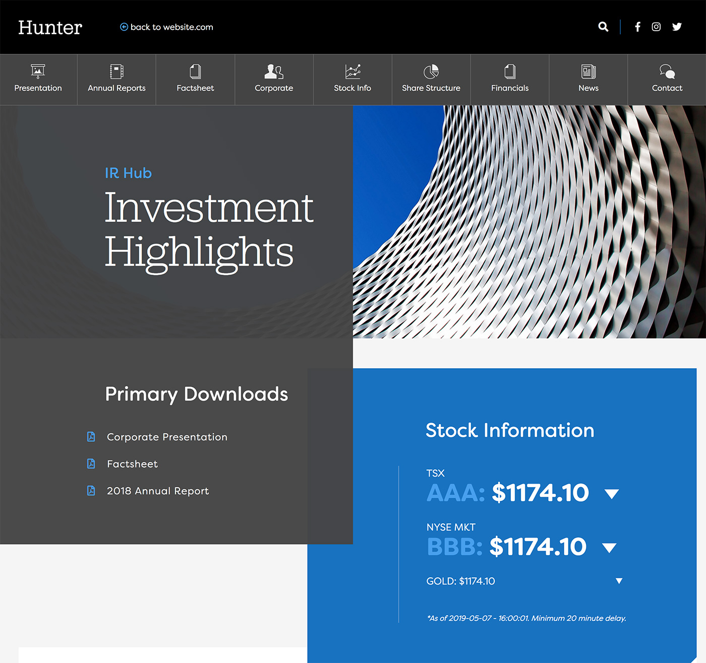
When it comes to your IR website, remember that you aren’t only highlighting your stock price or most recent numbers. You need to focus on marketing yourself on every single page, as well as your stats. Whether it’s through visual appeal, a well-crafted and optimized website, valuable content, or interactivity and animation, more investors are now expecting to view public company websites with a great visual and user experience. Here are 8 must-haves that investors want to see on your IR website.
1. A well designed website makes all the difference
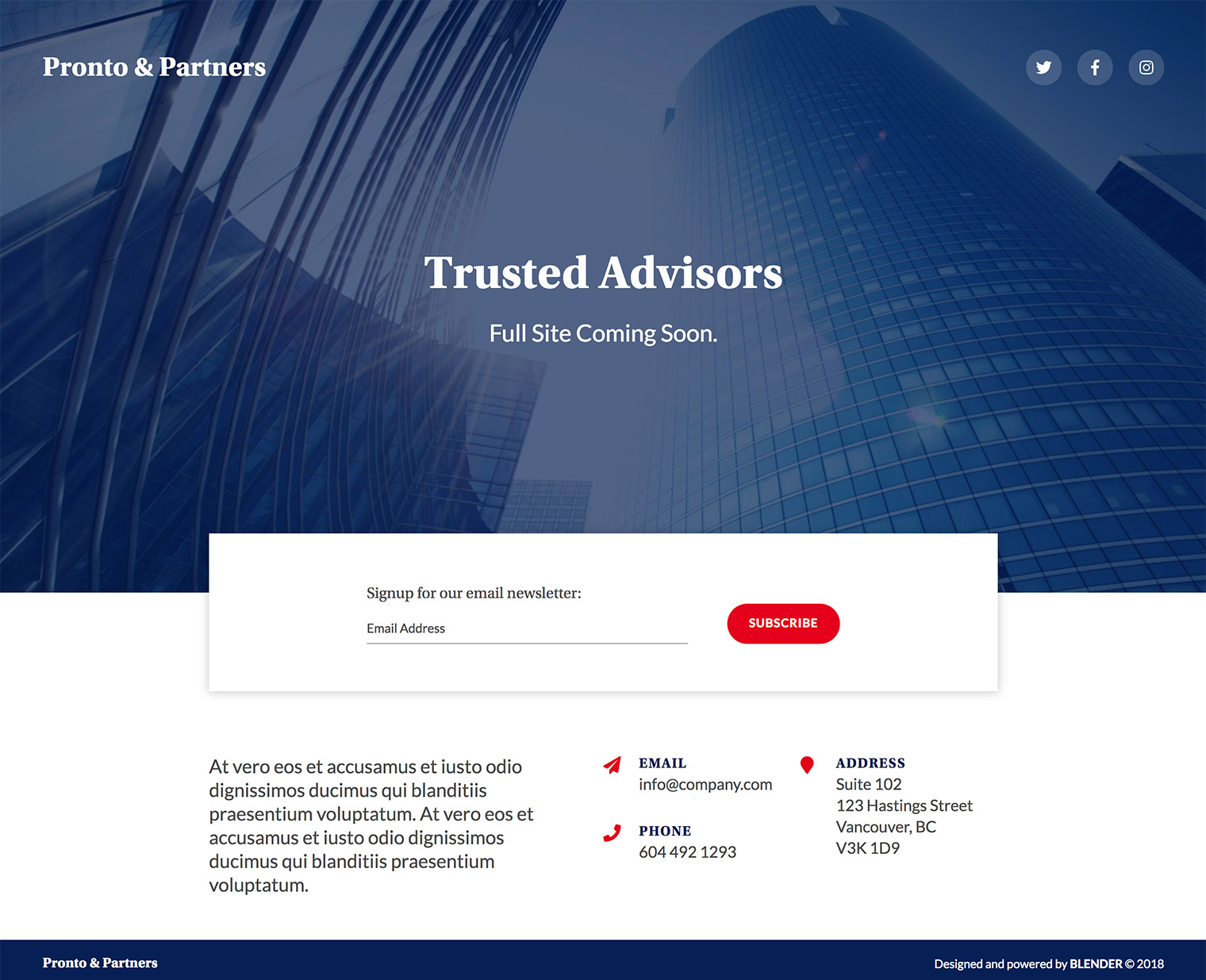
If your website looks professional, works seamlessly, and is visually appealing to match your brand, you will automatically build a better foundation with investors. No one in the digital age wants to do business with a company without a seamless website. The better your website looks and functions, the more credible your company will come across to investors. If you show that you’ve taken the time to focus on your visual brand and build a lasting digital experience, your audience will trust that your company will be around in the long run too.
2. Use interactivity to highlight key info for investors
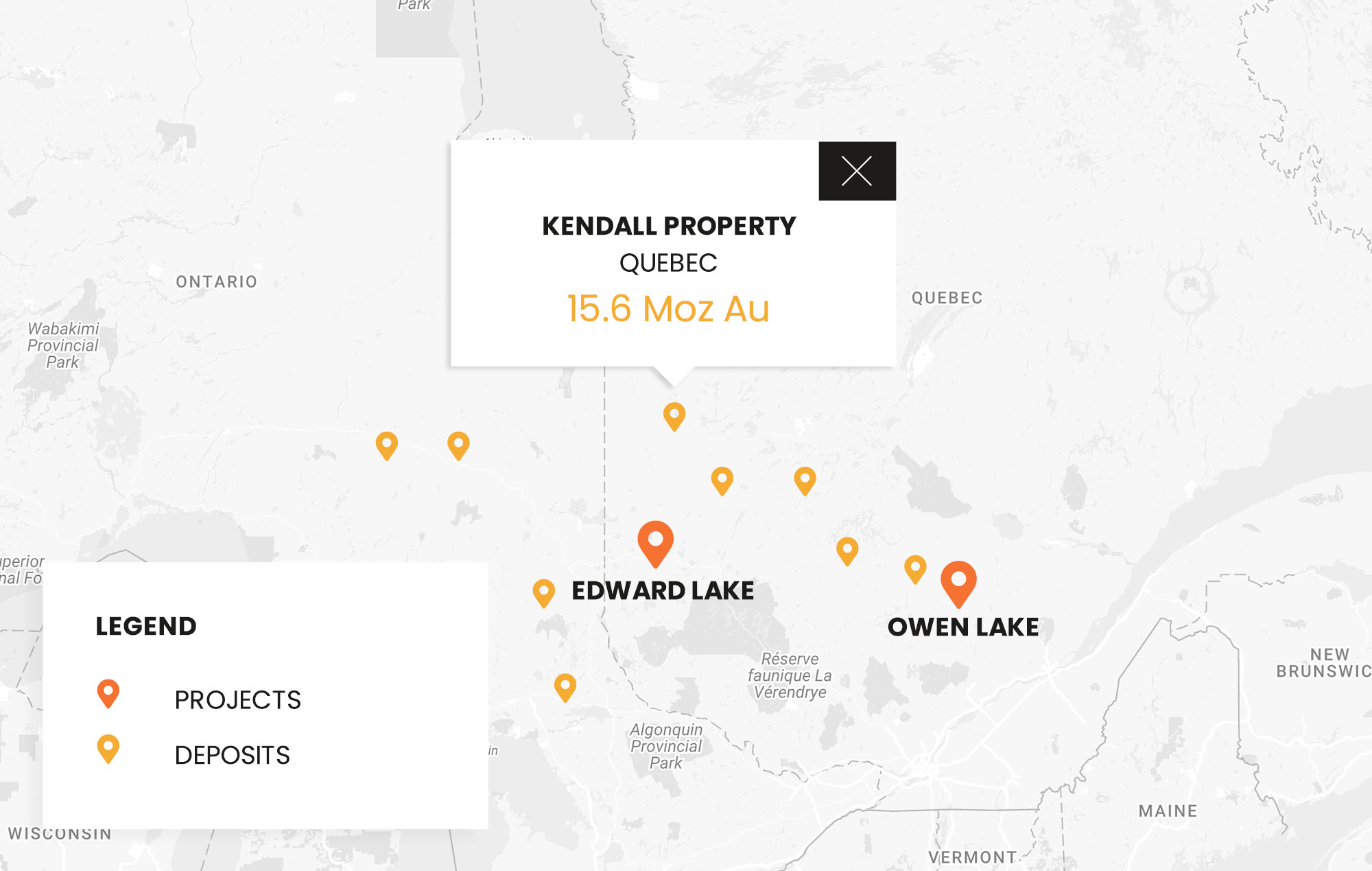
Including dynamic elements on your website will make for a better user experience for investors and makes the info they’re looking for more accessible. Consider building an interactive map for your key projects that investors can navigate, hover over get more information, and learn about project highlights. Interactivity can also include elements such as infographics and data charts so you can bring a little color and vibrancy to your numbers.
3. Ensure every line of website content speaks to your target audience
Implement a website content audit and ask yourself ‘is this paragraph serving a purpose?’ Every line on your IR site should target potential investors whether you’re highlighting your community engagement, environmental awareness, building trust through testimonials, or telling your company story. With design, make sure to highlight priority information so it is the first thing investors see when they navigate to that specific page.
4. Include project galleries and management profiles with recent photos
Build investor trust by incorporating recent photos of your on-the-go projects as well as management photos and profiles. If your website looks outdated, you won’t portray yourselves as a company actively seeking investors. Having a pool of recent photos is also useful for general marketing materials and IR presentations.
5. Make it easy for investors to download reports and presentations
Investors are often on the move and juggling between multiple portfolios and companies that might be worth their time. The best way to stay top of mind is to ensure that every investor presentation on your website is branded, easily digestible, and effortless to download and view offline. It’s also useful to link to your IR presentation on your contact page, as well as on the specific investor section of your site.
6. Have you thought about mobile?
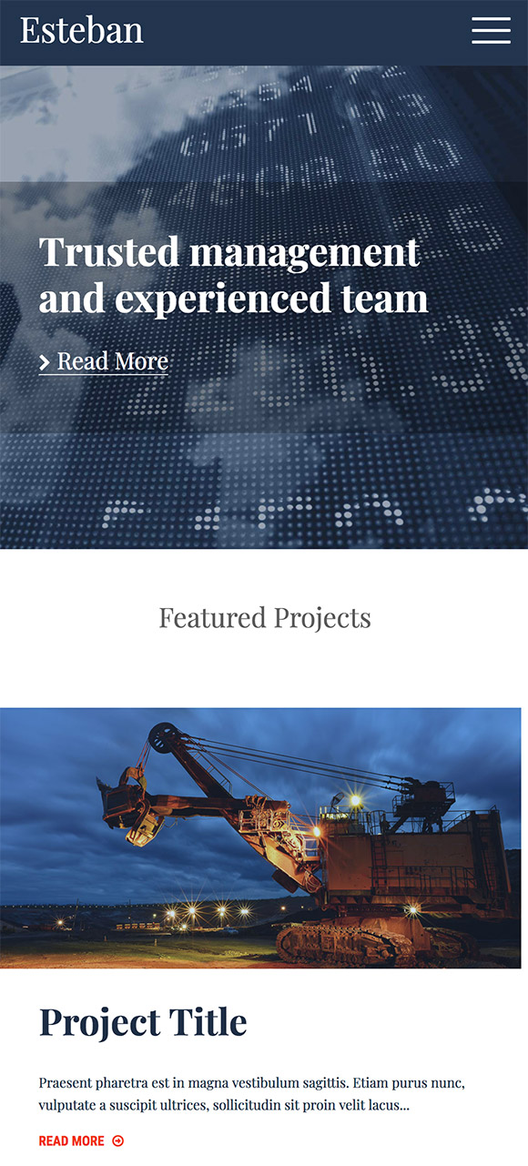
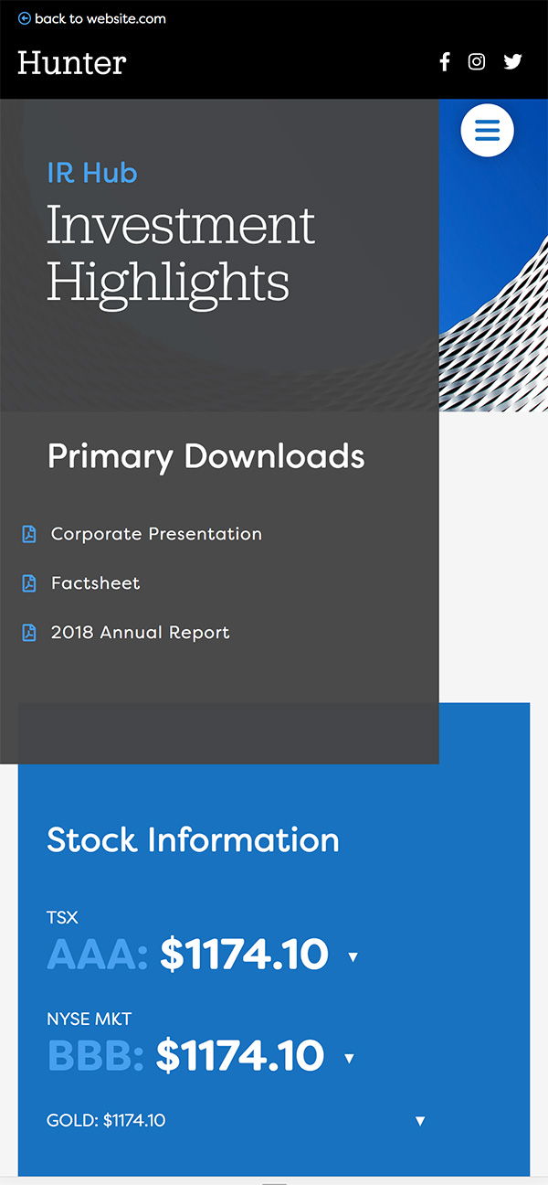
A 2017 analysis by comScore showed that multi-platform users (including tablets, smartphones, and laptops) make up the vast majority in most markets, with an average of 46% of people using more than one device to access online content. In the US, over 60% of markets use multi-platforms, while in Canada it hovers just over 50%. If your IR website isn’t accessible from mobile devices, or if you don’t have a website that’s either responsive or tailored for mobile, you’re missing out on a large level of investor interest. Would you continue to browse a website if it wasn’t appropriately sized, if text or images were out of place, or you couldn’t access the information you wanted? Consideration of user experience is key, especially with such a high percentage of mobile activity and engagement. You can access the percentage of your website viewers who use mobile, tablets, and more through Google Analytics.
7. Include multiple touchpoints for contact info and have a specific form for IR
Make it as easy as possible for investors to reach out to you to learn more. Have a static contact button on your site that’s always present, and include multiple touch points where investors can go to get more information. These are ‘call-to-actions’ and allow for more conversions through multiple avenues. If they’re not ready to reach out yet, include areas where they can sign up to stay updated on your news, receive monthly newsletters, and download your IR presentation and annual reports.
8. Create short and shareable videos with text overlays to highlight key info
With already slim attention spans shrinking every year, try experimenting with different ways to showcase important information on your IR site. Try filming short videos to get across information like Letters from our CEO, important CSR projects, or other valuable company news. Have drone footage of a project site? Include it in an interactive video banner to stand out and really make your website a digital experience to be remembered.
Piknic was created by Blender, an award-winning website design and development agency for public companies. Have specific questions on how you can take your IR site to the next level? Reach out to us at [email protected].
Back to Blog